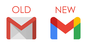
Google is replacing its iconic Gmail envelope logo with a design that’s a lot more in keeping with other Google products.
The new Gmail logo is now an M made out of Google’s core blue, red, yellow, and green brand colors.
It more closely matches similar logos for Google itself, Google Maps, Google Photos, Chrome, and many more Google products. The envelope is no more.
Fast Company reports that Google considered dropping the M altogether or fully removing the Gmail red color, but people involved in user research studies weren’t happy with the changes.
The studies did, however, help Google realize that the envelope part of the Gmail logo wasn’t a critical design element, allowing the team to experiment with keeping the M and adding Google’s traditional color palette.
The new Gmail logo still feels predominately red, with a small touch of yellow and the blue and green holding up the arch of the M.
“If you put it alongside Google’s other logos, it’s hard to differentiate between them, though. Google has also revamped its Calendar, Docs, Meet, and Sheets logos to match the new Gmail design,” the report said.
The new logos are part of a broader revamp of Google’s G Suite software, which has now been rebranded to Google Workspace.
Google is attempting to merge Gmail, Chat, and Docs into a central location, to better compete with the integrated approach of Microsoft Office and specifically Outlook email.


